


Color Wheel

Color is a visual perception created by the electromagnetic spectrum, which we experience through the light that bounces off or is reflected by objects. It is not inherent in the object itself but rather how we interpret the light interacting with it. Our understanding of color is shaped by how our eyes perceive different wavelengths of light, allowing us to experience the vibrant world around us.
The traditional color wheel and the CMY color wheel differ in the primary colors that form the basis of each system. The traditional color wheel uses red, blue, and yellow as its primary colors, while the CMY color wheel is based on cyan, magenta, and yellow. This shift highlights the difference between additive and subtractive color models, which inform how colors are mixed and perceived in various mediums.
Through my work, particularly in Photoshop, I’ve learned to utilize a variety of tools to enhance my creative process. Tools like the Clone Tool and the Angle Tool were essential in creating the color wheel, allowing me to experiment with form and texture while understanding the technical aspects of digital art.
With my color wheel, I want the audience to notice how fun and engaging the creation process can be. By incorporating intriguing and unexpected subjects, I hope to convey the idea that the exploration of color doesn’t have to be static. It can be dynamic, playful, and visually captivating, offering both an artistic challenge and a sensory delight.
Color Harmonies
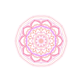
Analogous Color Harmony
Analogous Color Harmony
Analogous Color Harmony

Valentine Color Pallet


Lemon-Lime
Color Pallet


Fall
Color Pallet
Color harmonies are the purposeful arrangement of colors on the color wheel that work together to create visually pleasing compositions. For this project, I explored various color harmonies, each drawing inspiration from different themes. Specifically, I used analogous harmonies and three distinct essences: Valentine-themed, lemon-lime-themed, and fall-themed.
Among these, the fall-themed color harmony turned out to be the most successful. The combination of warm, earthy tones not only created a harmonious aesthetic but also evoked a sense of comfort and balance. The colors flowed seamlessly together, resulting in a visually appealing and soothing effect.
Through this project, I hope to invite my audience to appreciate the versatility and beauty that can be achieved through thoughtful color choices. Each color harmony I used is designed to evoke a specific mood and feel, showcasing how different combinations can be both striking and fun to explore.
Ultimately, I want my audience to notice the impact of color harmonies in creating compositions that are not only aesthetically pleasing but also evoke emotion and engagement.